Retail Personas Project
I love personas. I believe every product should begin with a personas, and those personas should be openly shared, updated, displayed and referenced throughout the product’s timeline. Thus I was given the task of updating our retail banking personas - a task that had been brought up as a need time and time again.
For the uninitiated, a persona is “….a fictional, yet realistic, description of a typical or target user of the product” (Nielsen Norman Group). They can be informative and useful wrapped up in a minimal, practical package. When done properly, they represent real data on users, or potential users, thorough a fictional representation. A “character” if you will. Personas are also a chance to build empathy and build the story of your end users in a document that’s easy to read at a glance. Personas can also determine the direction of a product or inform important decisions about that product.
The key is that these personas must be built on real data.
An example of a persona from my personal project “Tome” showing an image of a woman with a quote as well as other relevant data including motivations, personality and frustrations.
What had been accomplished?
In previous research with our clients (financial institutions) a fellow designer had interviewed a number of our clients to dig into who they considered their customers (our end users) and filter those customers into categories.
Out of that research a few customer “types” were discovered
Wealthy
High Earner Not Rich Yet (H.E.N.R.Y.)
Mass Market
Underbanked
Wealthy customers managed multiple investment accounts and primarily lived off those accounts. H.E.N.R.Y. customers still worked and made over $70K yearly. Mass Market customers were the largest category as they usually had two (or more) accounts, primarily and checking and savings account, and sometimes had a mortgage account as well. Underbanked customers usually had just a single account and didn’t move money much at all. These customer types were what our clients found valuable when defining their own customers.
Please keep in mind these “types” have no bearing on decisions made by a financial institution and were used only to make product discussions between our clients and ourselves easier to facilitate.
We decided not to create a persona for the Wealthy category as we felt their needs were outliers from the rest of the persona types. Thus we settled on 3 retail customer personas - H.E.N.R.Y., Mass Market and Underbanked.
Where I Pick Up
The first order of business was to research potential users to find how closely they might match with these customer types. Because the previous research had been done only with our customers, and their own assumptions defined these customer types, I wanted to balance those assumptions with the customers themselves to better define these customer types. I also wanted to find out more about where the cut off lay between these categories as Mass Market seemed to blend into the other two categories.
In order to help gather that data and insights about our audience, I collaborated with our research team to form an interview script to dive deeper into their banking habits and find out more about their experience finding a bank account or loan.
An image showing part of a screener survey that allowed us to accept or reject participants based on our criteria. Questions displayed here show a range of possible answers regarding a new deposit account and a loan account.
I looked for customers who opened a bank or loan account within the last 6 months so the experience would still be fresh in their mind, and divided test participants into three categories based on their income level, number and type of accounts, debt ratio and credit rating. User Interviews allowed us the flexibility to source test participants from all over and we were delighted to find that a number of testers met our criteria, giving us a large pool to draw from.
In the end, 6 test participants were chosen, two participants to represent each customer type. Our script contained 56 questions and ran an hour long. We asked about their experience finding and choosing a financial institution, onboarding experience with a loan provider, experience switching financial institutions (if applicable) and credit cards. The script was the same between each participants for consistency and data comparison.
The results were astounding.
The Experiences
I heard from multiple people who would happily pay more to have better convenience, from someone who struggled to make ends meet while working a full-time job, from someone who had to choose their financial institution based on the walking distance from their residence. Stories from the nurse who considered herself financially savvy but retained tens of thousands in debt, the tech worker who got a loan from her father, the line worker whose only option at times was to use a cash advance loan and who struggled to get our of the predatory cycle it resulted in.
One of the common threads among all test participants was they they chose their financial institution based on familial recommendations. People relied on the advice of their family, or their financially savvy peers, and used that as their starting point when choosing a financial institution. This was especially significant as many of our clients focused on the onboarding process but this data showed that focusing on satisfying and supporting current customers long-term could result in generational relationships.
Organizing the data
Now that I had this data, the next step was to assemble it all into a format that would be easily digestible for everyone from Executives to Product Owners to QA.
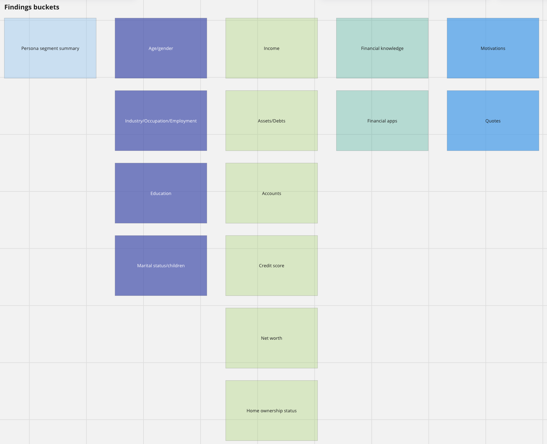
A chart showing buckets of data arranged into categories. The categories are color coded to make wireframing a layout easier.
I had core groups of data that I wanted to capture:
demographic data
financial information
financial knowledge
onboarding experiences
Putting all this information on a single sheet without overload was no small order. I ended up bucketing all of the data and wireframing the persona sheet to determine a usable layout for all the information. During this step I realized that we also needed a way to capture the emotional data we found in our testing sessions. Finances are very personal and a lot of emotion surrounds the topic. I wanted to highlight that as well so we had a constant reminder of how what we make affects people in a very real way.
A wireframe of a persona sheeting showing a layout of color coded blocks of information.
After designing several wireframes I settled on a layout that worked the best and began to organize the data into that wireframe. At one point I became stuck on how to display the type and amount of accounts a persona has and collaborated with a fellow designer to jump start some new ideas before landing on a word cloud. While I don’t find word clouds generally useful, I felt that this would be the perfect way to show the account types, as we could assign weight to the more common account types found for a particular customer segment.
Naming convention
Another element that stumped me for a while was the customer segment names themselves. The personal stories I discovered through testing got under my skin, and I had trouble connecting those stories with the names given to the groups by the small collection of financial institutions we interviewed. What exactly does “mass market” mean to the father of two in a single family household trying to get a loan to buy a car? What does H.E.N.R.Y mean to the young doctor trying to pay their medical school bills?
Thus, I have these segments subtitles that I hoped better represented these customer segments. Mass Market became “The Everybody”, Underbanked became “The Opportunity” and in the case of the H.E.N.R.Y segment, I simply spelled out the acronym to reduce confusion. I also pulled direct quotes from the interviews that I felt worked well to capture the spirit of each customer segment.
An image of a section of the Underbanked persona showing a quote that reads “I never could be comfortable. No matter how much I had, I knew I had an amount to pay back and I could never think clearly with that on my mind.”
The End Result
In the end, I wrote up descriptions to condense the general findings from the research, and ended up with the following three personas:
Mass Market - “The Everybody”: The Mass Market consumer segment tends to be financially savvy and are aware of fees and charges associated with everything from their savings accounts to a money transfer. They may have a focus on their credit score, making strategic choices to improve their credit. Emphasizing the value they receive with their Financial Institution will ensure a long-term relationship.
The Mass Market persona sheet showing demographics, financial data and onboarding experiences.
H.E.N.R.Y. - “The High Earner Not Rich Yet”: The H.E.N.R.Y. consumer segment values convenience and ease over finding ways to earn incentives or a better rate. When creating onboarding experiences for H.E.N.R.Y., making things simple, doing much of the work for them and spelling out the value you provide will go far in securing their loyalty.
The H.E.N.R.Y. persona sheet showing demographics, financial data and onboarding experiences.
Underbanked - “The Opportunity”: The Underbanked consumer segment is looking for options where few may exist. They have an awareness of their financial situation, and a desire to improve their finances and build credit, but may feel trapped. They seek low minimum requirements and flexibility, and bridging the gap can result in long-term loyalty that grows with their finances.
The Underbanked persona sheet showing demographics, financial data and onboarding experiences.
Once the personas were completed, I presented them to the larger design team and then to the larger organization as a whole to gather support and buy-in. Some really excellent questions and discussion came from those presentations, and I enjoyed sharing more of this effort with executives and decision-makers and it gave them a lot to chew on. One of the questions I received during the larger presentation was what area I felt we weren’t considering enough with our current products and I answered that we need to focus more on supporting our customers long-term because the data showed that the first place customers look to when finding a new financial institution is family and friends. Supporting and satisfying current customers can go a long way to ensure those generational relationships.
An example of an emotional journey taken from the Mass Market persona showing the ups and downs of an onboarding experience.
Final Thoughts
Personas are living documents and should never grow stale. They might need to be updated or retired as time passes and new and more information is discovered.
This was an excellent project to take the lead on, and I am grateful for all the guidance and support I received along the way. This project was mostly hands-off from my manager at the time, and I am grateful for his trust in me. I look forward to more opportunities like this one.


